


How can the tiling effect of high-grade antique bricks be optimized through layout design?
Release Time : 2025-12-22
Optimizing the tiling effect of high-grade antique bricks requires a multi-dimensional approach, considering spatial adaptability, visual hierarchy, color coordination, and detail processing. Through scientific planning and artistic expression, a balance between function and aesthetics can be achieved. The core logic lies in combining the characteristics of the brick with the needs of the space, using layout design to break monotony and create a tiling effect that blends historical charm with modern aesthetics.
Spatial adaptability is the fundamental premise of layout design. High-grade antique bricks come in various sizes, from the common 600×600mm to the large 900×1800mm. Different sizes significantly affect the visual extension of a space. For example, small to medium-sized bricks are suitable for small spaces, enhancing the overall sense of unity through dense tiling; large spaces can use large bricks to reduce the number of gaps and create an open and transparent atmosphere. Furthermore, the flexible use of irregularly shaped bricks (such as hexagons and herringbone patterns) can break the rigidity of traditional rectangular tiling, injecting unique personality into the space. For example, using a herringbone pattern in a narrow corridor can guide the flow of sight and alleviate the feeling of confinement.
Creating a sense of visual depth relies on the rhythmic variation in the layout design. A single tiling method can easily make a space appear monotonous, while combining tiles of different sizes, textures, or colors can create rich visual layers. For example, in living room floor tiling, using the main tile as a base and embedding tiles of the same color but with a darker texture as accents can highlight key areas while maintaining overall harmony. Furthermore, using a "color-blocking" technique, interspersing a few contrasting tiles within the main color scheme, can enhance the vitality of the space, but care must be taken to control the color proportions to avoid being too jarring.
Color harmony is a key element of layout design. High-grade antique bricks typically feature low-saturation colors such as beige, gray-brown, and dark brown. These colors inherently possess a vintage feel, but the layout design must be used to avoid a dull feeling. For example, in wall tiling, dark-colored tiles can be used as borders or borders to contrast with light-colored main tiles, highlighting structural lines and enhancing the three-dimensionality of the space. For open-plan spaces, it's essential to ensure the colors of the floor and wall tiles complement each other. This can be achieved by extracting a hue from the main tiles and using it as the wall accent color, creating visual continuity.
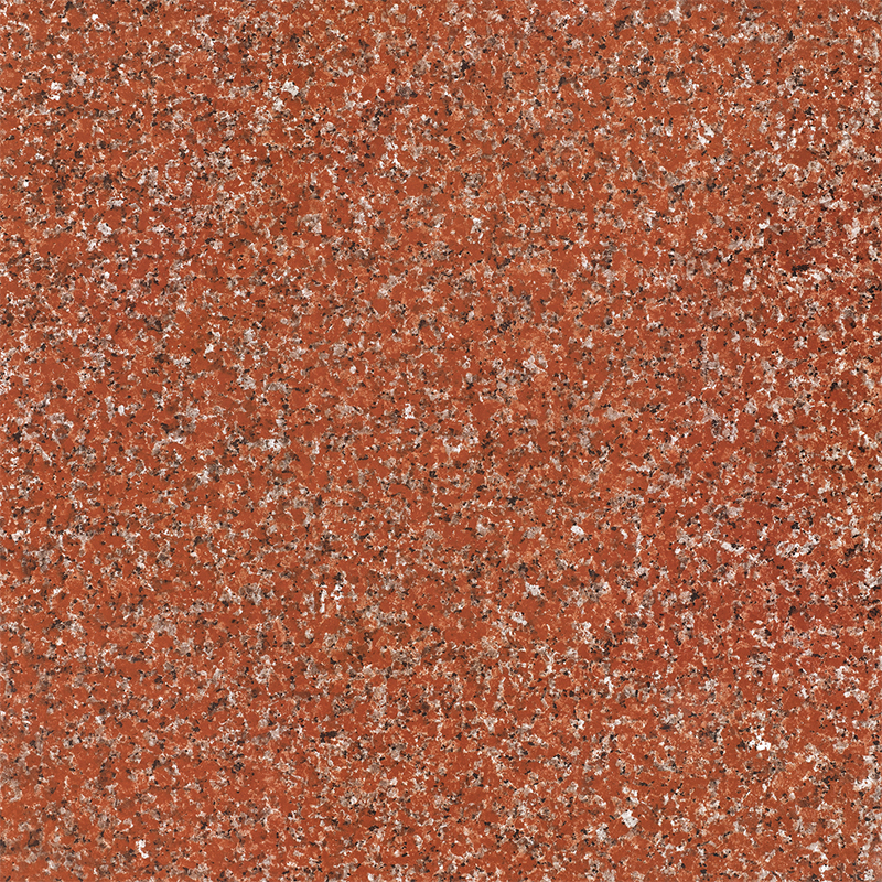
The combination and extension of textures can enhance the historical charm of high-grade antique bricks. Their surface textures often mimic the feel of natural stone, wood, or terracotta, such as cracks, mottles, and wood grain. Layout design should fully utilize these texture features. For instance, when laying imitation stone textured tiles, a staggered tiling method can simulate the random arrangement of natural stone, enhancing realism; while imitation wood grain tiles are best laid using a stepped tiling method, where the tile joints are arranged in a stepped pattern, replicating the extension of wood flooring. Furthermore, combining tiles with different textures, such as alternating smooth and rough surfaces, can create a dual contrast of tactile and visual appeal.
Attention to detail is a key aspect in improving the quality of tiling. High-grade antique bricks typically feature rounded or chamfered edges, requiring careful control of the grout width during layout. Narrow grout lines (1-2mm) suit modern minimalist styles, highlighting the brick's inherent texture; wider grout lines (3-5mm) create a more rugged look, suitable for industrial or retro styles. Furthermore, for special areas (such as corners or columns), custom-cut or irregularly shaped bricks should be used for edging to ensure overall integrity. For example, when laying antique bricks around a column, the bricks can be cut into fan shapes and layered to create a three-dimensional decorative effect.
The interaction between lighting and tiling design further amplifies the beauty of high-grade antique bricks. Warm-toned lighting (e.g., 2700K-3000K) emphasizes the brick's vintage texture, while cool-toned lighting is more suitable for modern minimalist styles. In layout design, the direction of the grout lines can be adjusted to guide the light reflection path; for example, aligning the grout lines parallel to the window direction enhances the penetration of natural light. At night, illuminating the grout lines with concealed LED strips creates soft, layered light and shadow effects. Optimizing the tiling effect of high-grade antique bricks requires balancing functionality and artistry. This involves techniques such as spatial adaptation, layering, color coordination, texture matching, attention to detail, and interactive lighting to transform the brick's characteristics into a spatial language. The final tiling effect should retain the historical charm of the antique bricks while meeting the aesthetic needs of modern life, achieving an organic fusion of tradition and innovation.